Myth: Design Trends Don’t Matter (First-impression research)
Myth: “Design trends don’t matter. If your information is solid, people will look past the visuals.”
Truth: In a digital-first world where first impressions happen in seconds (and often on a phone), visual design is not decoration—it’s decision-shaping.
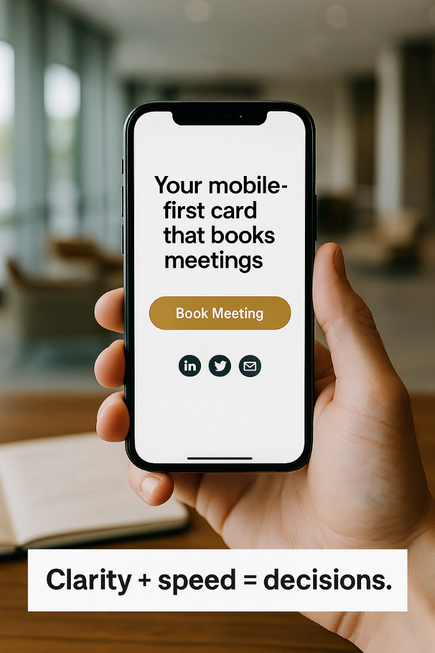
But here’s the twist: hopping on every flashy trend isn’t what wins. What wins is evidence-backed, conversion-oriented design that delivers a fast, interactive, and trustworthy first impression across devices.
I’m John White, Marketing Systems Director for White On White Enterprises and founder of the WOWECard. At WOWE, we help professionals move beyond paper business cards to Progressive Web App (PWA) business cards that actually do something—book meetings, play videos, route to social, capture leads, and work even offline. That shift is what first-impression research points to: not “trend for trend’s sake,” but speed, clarity, and interaction the moment someone meets your brand.
Why This Myth Persists
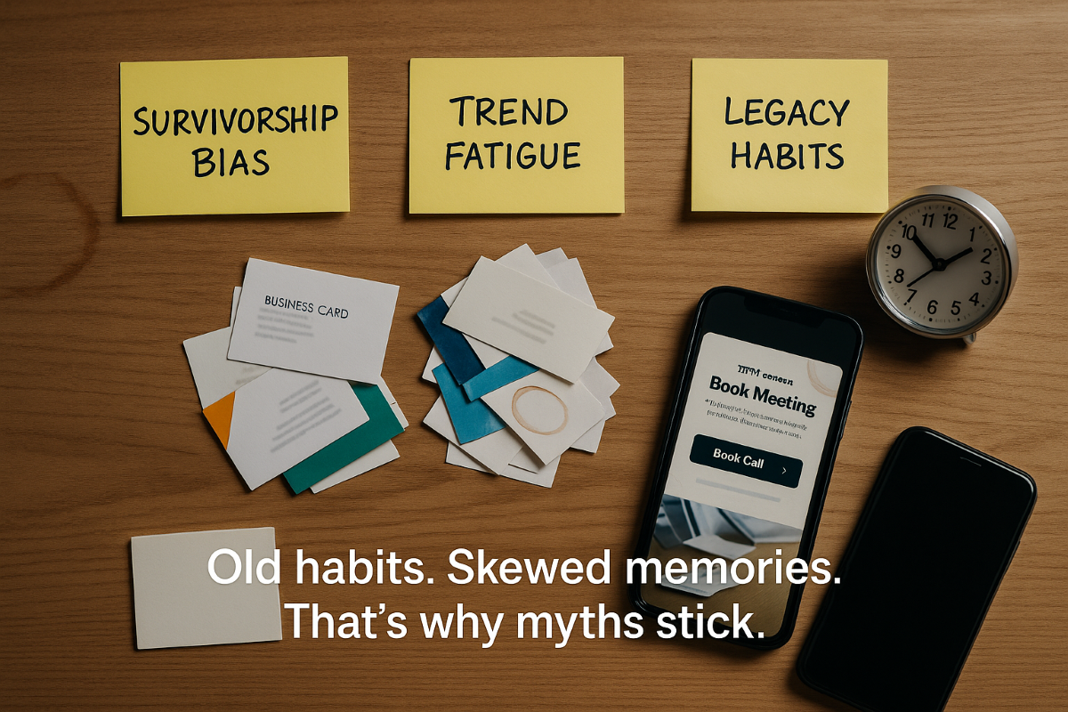
1. Survivorship bias. You remember times when content “spoke for itself,” forgetting how many other interactions quietly failed because the presentation didn’t earn attention or trust.
2. Trend fatigue. After seeing gradient-of-the-week and micro-animations with no purpose, people confuse trend chasing with effective design. They’re not the same.
3. Legacy habits. Paper business cards feel safe. They’ve been around forever, so we assume they’re “good enough.” But in practice, they get tossed, can’t be tapped, and can’t convert.
4. Misread minimalism. “Simple” does not mean “thoughtless.” Clean, fast, and interactive is the new premium—rooted in user outcomes, not aesthetics alone.
What First-Impression Research Actually Tells Us
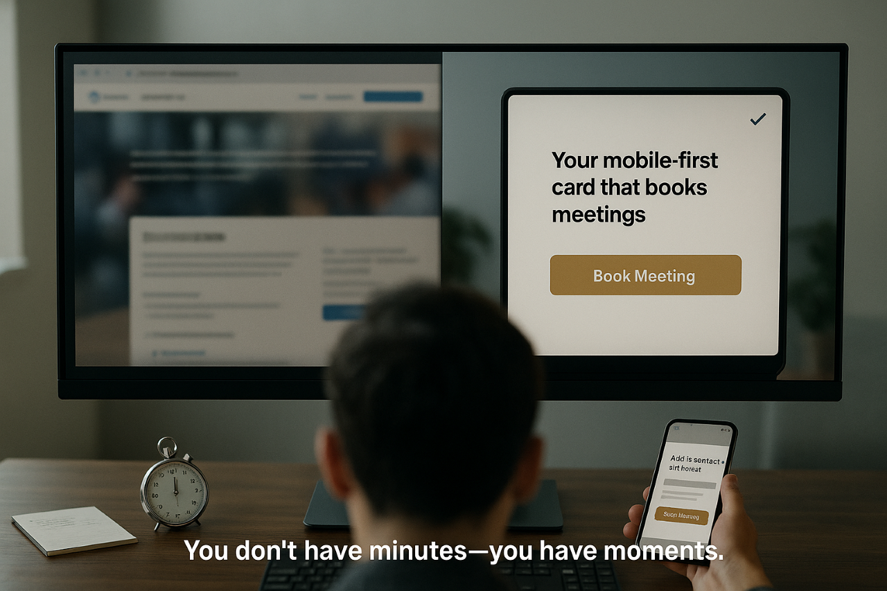
You don’t have minutes—you often have moments. People form a gut judgment about credibility, relevance, and ease almost instantly. Three elements consistently tip the scales:
- Perceived speed. If it loads fast and responds instantly, users assume competence. Lag reads as “unreliable,” especially on mobile data or spotty Wi-Fi at events.
- Visual order and hierarchy. Clear headings, ample white space, and scannable buttons help the brain recognize what to do next without effort.
- Interactive affordances. When there’s an obvious tap—“Book a meeting,” “Watch 30-sec demo,” “Save contact to phone”—the pathway from interest to action is short and satisfying.
Trends can help or harm. A tasteful motion cue that confirms a tap? Helpful. A wallpaper of on-brand noise that buries the CTA? Harmful. The difference is intent: Does the design reduce friction and increase action?
Paper Cards vs. PWA Cards at the First Impression
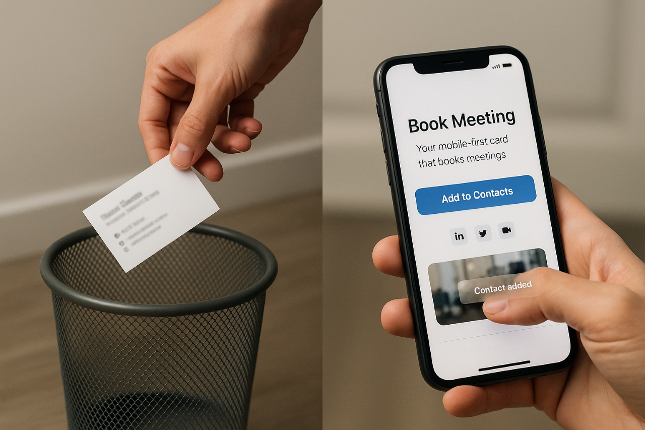
Paper business cards:
- Static, passive, easy to lose
- No analytics, no A/B testing
- Can’t book meetings, play demos, or save directly to contacts
- Wasteful and non-interactive
PWA business cards (like the WOWECard):
- Tap to save contact instantly (no manual typing)
- Book meetings right from the card
- Play short videos to showcase your product
- Link to social, menus, inventory, listings, or donation pages
- Works online and offline across devices (no app store required)
- Real analytics to learn what resonates
- Update once, refresh everywhere—no reprinting costs
In other words, design that does things beats design that just sits there.
The Design That Matters: Outcome-Driven, Not Trend-Chasing
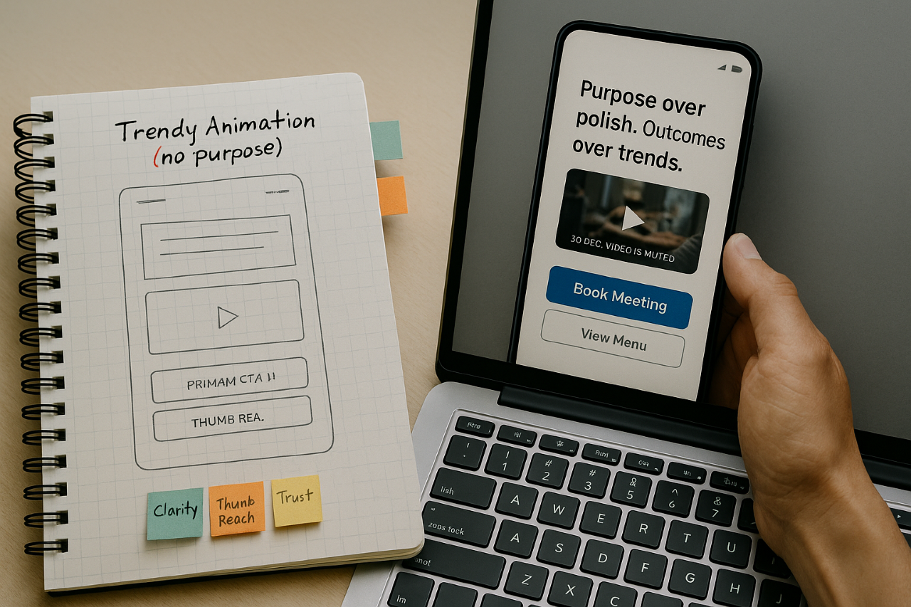 Here’s a practical way to think about design for first impressions:
1. Clarity > cleverness.
Your headline, your offer, and your next step should be obvious on a 5-inch screen in under 5 seconds.
2. Motion with meaning.
Micro-animations should confirm taps (button press), signal progress (spinner during booking), or highlight state changes (saved to home screen). If it doesn’t help, cut it.
3. Color as guidance.
Use color to focus the eye on the main action. Choose one primary accent for CTAs, and keep the rest calm.
4. Iconography as shortcuts.
Social icons, phone/email icons, and booking icons reduce reading load. People decode pictures faster than text.
5. Mobile muscle memory.
Place your primary CTA within thumb reach, design for single-handed use. Keep forms painfully short.
6. Speed is a feature.
Compress media, lazy-load video, and prefetch critical routes. People equate fast with credible.
7. Trust signals up front.
Quick testimonials, star ratings, “as seen in,” menu badges, or secure booking notices—show proof early.
A 10-Point “First-Impression” Field Test (Run It at Your Next Trade Show)
1. The 3-Second Snapshot: Can a stranger tell what you do and who it’s for in three seconds?
2. Single CTA Rule: Is there one dominant action (Book, Call, Order, Tour, Apply) visible without scrolling?
3. Tap-to-Save: Can someone save your contact with one tap?
4. 30-Second Demo: Is there a short video that shows value—fast?
5. Offline Resilience: Does it still work in a concrete hall with terrible Wi-Fi?
6. Cross-Device Proof: Does it feel native on iOS and Android, tablet and desktop?
7. Load Under Pressure: Does it load quickly while nearby booths are streaming and attendees are congesting networks?
8. Analytics: Can you see what people tapped and tweak before day two of the show?
9. Accessibility: Are contrast, font size, and tap targets friendly for real-world hands and lighting?
10. Update Velocity: Can you fix a typo or swap a CTA mid-event—no reprints, no downtime?
If you answered “no” to more than two, your design isn’t working hard enough—no matter how trendy it looks.
Industry Snapshots: What “Effective” Looks Like
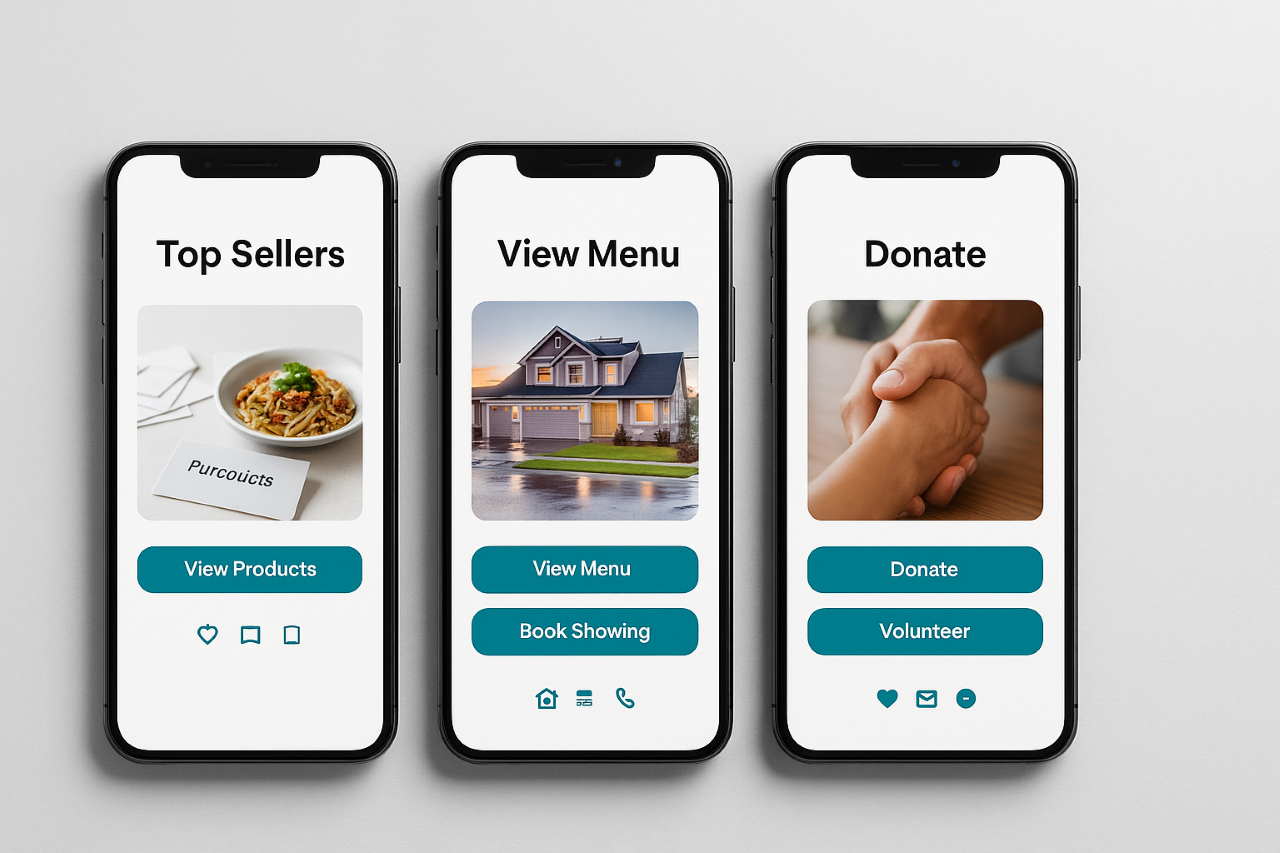
- E-commerce: A WOWECard links straight to a “Top Sellers” carousel and “Tap to Buy Now,” with Apple/Google Wallet contact save. Short product reel auto-plays muted with captions for noisy expo floors.
- Restaurants: One-tap “View Menu,” “Order Pickup,” and “Map & Hours.” A 15-second ambience clip sets the vibe; the booking button anchors the bottom of screen.
- Real Estate: “View Listings Near Me,” “Book a Showing,” and “Save Agent Contact.” A 30-second walkthrough video replaces the old brochure stack.
- Auto Dealers: “Browse Inventory,” “Value Your Trade,” and “Schedule Test Drive.” Trust badges (warranty, financing available) appear immediately.
- Leasing Offices: “See Available Units,” “Apply Now,” “Tour Today.” A gallery loads fast; availability is live, not printed.
- Non-profits: “Donate,” “Volunteer,” “Upcoming Events.” Impact numbers and one human story appear above the fold.
- Startups & SMBs: “What We Do,” “Book a Call,” “See a 30-Sec Demo.” Crisp value props, single CTA, zero fluff.
Across all of these, design trends only help if they compress time to understanding and reduce friction to action. Everything else is noise.
How WOWECard Turns First-Impression Research Into Results
The WOWECard is a Virtual Business Card Progressive Web App Creator that bakes these principles in by default:
- Always on, everywhere. App-like experience on any device—even without internet.
- Action-first layout. Your primary CTA is thumb-reachable and obvious.
- Interactive by design. Clickable links, video, social, booking calendars—not just a pretty face.
- Update once, reflect everywhere. No reprint cycles, no waiting.
- Privacy-friendly analytics. Learn what earns taps and optimize between conversations.
- No app store gatekeeping. Share via QR, text, email, or NFC—open instantly.
This is not about chasing the “look” of the moment; it’s about instrumenting your first impression to drive outcomes.
The Bottom Line
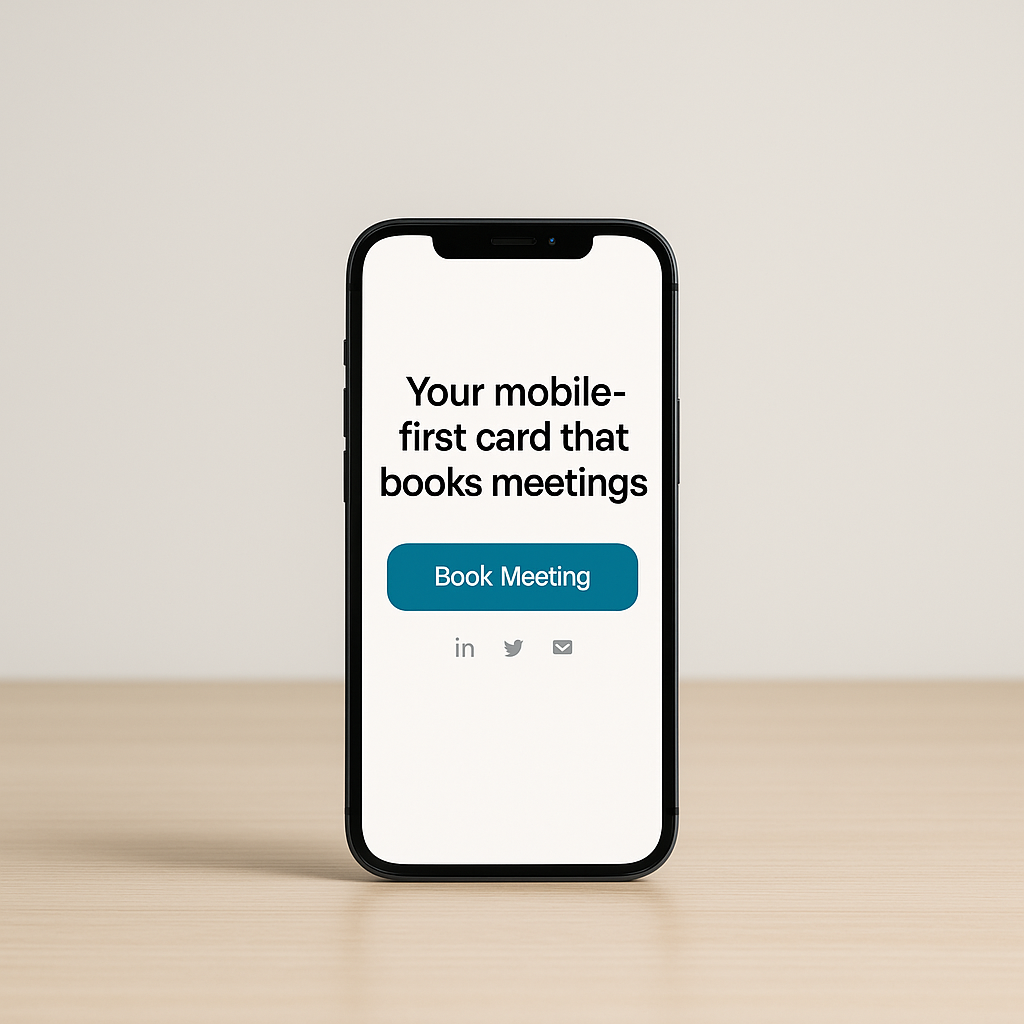
“Design trends don’t matter” is a comforting myth when you’re tired of glitter with no goals. But the research-driven reality is clear: people decide fast—and the right design (clear, fast, interactive) makes those decisions land in your favor.
At trade shows, in lobbies, on coffee breaks, and in inboxes, your first impression should work like a top salesperson—on every device, in any connection condition.
Paper business cards can’t do that. A PWA can.
Ready to Redefine Your First Impression?
Get The WOWECard—redefining how you network.
We bring innovation to the traditional business card with a Digital Business Card Progressive Web App Creator that works on all devices, online and offline. Show your value, book meetings, share videos, and make connections that lead to action.
Revolutionize your networking with The WOWECard—your cutting-edge PWA solution for modern professionals.
Click Here for more information and get your WOWECard Today!
What do you think about this article?